Kingbeast's Lair

Growling about the RPG industry and my gaming life. RPG and anime reviews from a passionate fan. (Formerly John's Hero HQ.)
Subscribe

Archive for the ‘Media Interests’

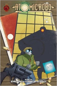
Comics Review – Black Dossier, Black Fire, And Blue Beetle

June 09, 2014 By: John Taber Category: Fun Reads, Media Interests

-== Black Dossier ==-

Author: Alan Moore
Artist: Kevin O’Neill
Layout: 7″ x 10″, 200 pages, softcover, with a color cover and interior.
Publisher: DC Comics through WildStorm
Year Published: 2007

-== What is it? ==-

Black Dossier is a League Of Extraordinary Gentlemen story set at a later time period with an updated set of characters. Alan Moore and Kevin O’Neill reprise their writer and artist roles.

-== What I Like ==-

The story in Black Dossier is somewhat novel in that the graphic novel itself is actually part of the story. Various elements of the dossier lead the characters along.

The presentation of the graphic novel is really special. There is a variety of content including newspaper articles, ads, etc. The last section even includes pages in red/blue 3D that can be viewed with a set of 3D glasses that are provided.

-== What I Don’t Like ==-

Black Dossier is a bit too esoteric for my simple tastes. I has a problem understand the story at almost any level. This is obscure storytelling even for Moore.

Even though I appreciate the array of content some of it was quite difficult to read because of the font choice and size. In some places the font needed to be larger so that it could be read in comic format.

-== Summary ==-

Black Dossier is a book that only hard core Alan Moore fans will love. It you fit that description give it a try.

I give it 4 out of 10 paws.

You can get copies of Black Dossier at Amazon at this URL for $15.66.
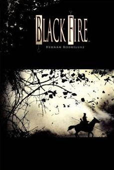
Black Fire Cover

-== Black Fire ==-

Author: Hernan Rodriguez
Artist: Hernan Rodriguez
Layout: 7″ x 10″, 160 pages, hardcover, with a color cover and interior.
Publisher: Archaia
Year Published: 2011

-== What is it? ==-

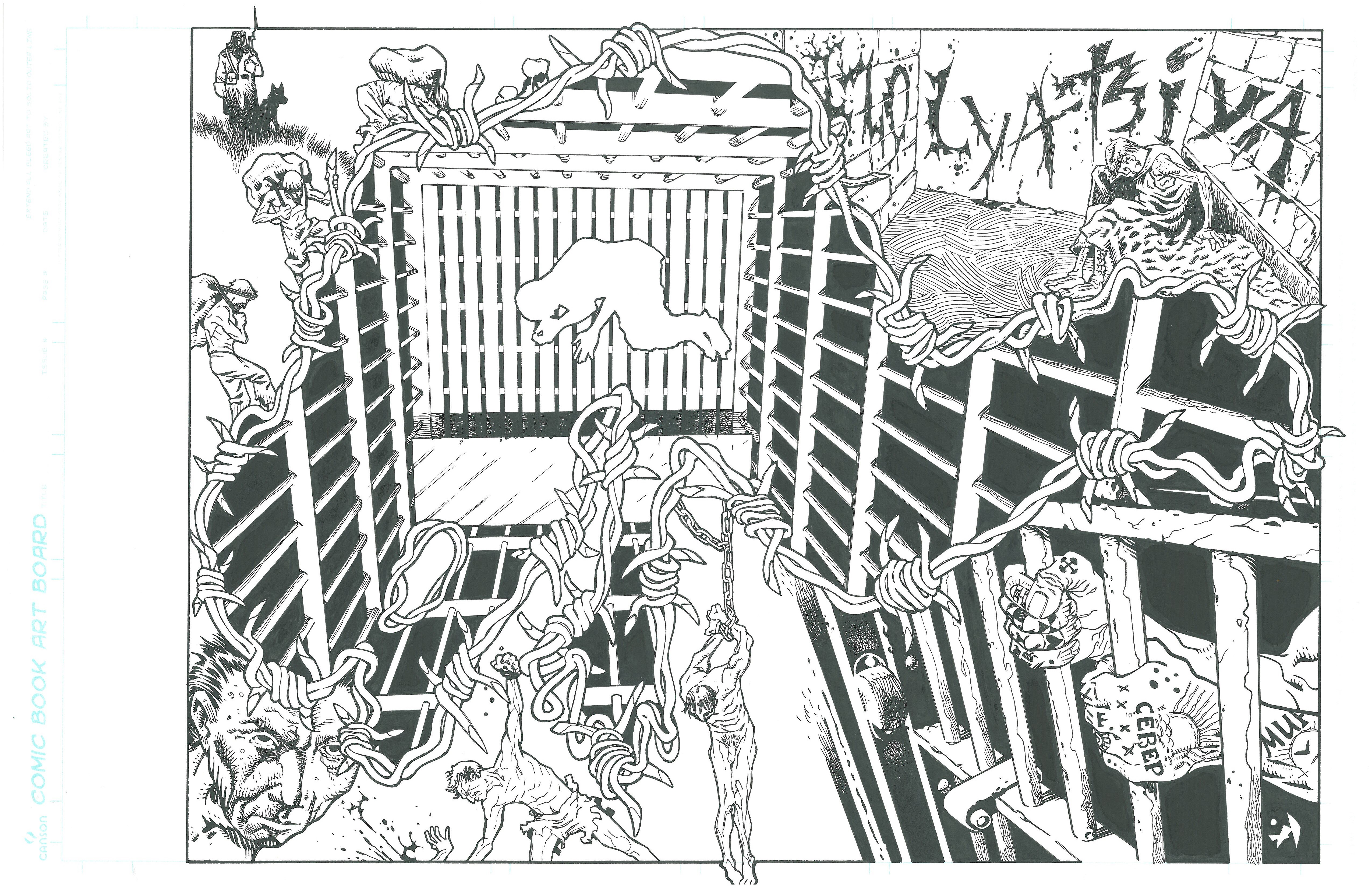
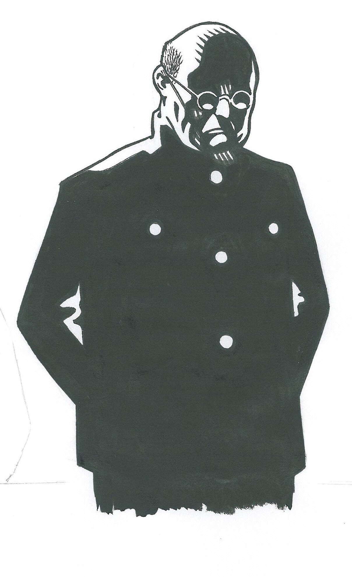
Archaia puts out some amazing products. When I read about Hernan Rodriguez’s story of soldiers entering a “cursed” village I thought it would be interesting so I picked it up.

-== What I Like ==-

The artwork in Black Fire is very different and quite spectacular. Rodriguez uses strong heavy black lines that he then covers with various watercolor washes. The combination is sharply contrasting. I think it really adds to the starkness of the environment and reinforces the depravity and bleakness of the story.

The covers and flaps are also beautifully done and work to enhance the overall presentation of the product.

-== What I Don’t Like ==-

The story in Black Fire seemed slow. I think some tighter editing and potentially the loss of some scenes might have helped. For example, you don’t need five scenes slowing how hungry the characters are becoming. One or two scenes is plenty. Saying this the end of the story was much stronger and wrapped up the book quite well.

I love the art choices made in Black Fire but individual pages can get cluttered with black lines. Too much black made the pages look sloppy.

-== Summary ==-

If you are looking for a dark historical horror story check out this one from Archaia.

I give it 6 out of 10 paws.

Amazon has copies of Black Fire for $19.51 at this URL.

-== Blue Beetle ==-

Author: Keith Giffen and John Rogers
Artist: Cully Hammer and Duncan Rouleau
Layout: 7″ x 10″, 144 pages, softcover, with a color cover and interior.
Publisher: DC Comics
Year Published: 2006 through 2007

-== What is it? ==-

I’ve always been a Ted Cord Blue Beetle fan and I am a huge fan of Leverage so when I learned that John Rogers did a reimagining I decided to take a look. I read the Shellshocked and Road Trip trade paperbacks which comprise the first twelve issues of the comic series.

-== What I Like ==-

The new Blue Beetle is a teenager named Jaime Reyes who finds an alien scarab creature that gives him various super powers through an organic power armor of sorts. The effect of an inexperienced wearer with a super suit from aliens instantly made me think of The Greatest American Hero. In Blue Beetle you can feel the same vibe…and I consider that a good thing. 🙂

The new Blue Beetle stories are a fantastic mix of drama and comedy. One aspect that I really like is that the scarab alien is a weapon so he is always suggesting killing anyone who get in their way even thought Jaime does not want to kill anyone.

The side characters in Blue Beetle are very well done. Some are known DC characters but most are created new for the series. His high school friends are really fascinating. By the end of the series I cared as much about them as the Beetle.

The artwork in Blue Beetle is not overly detailed but it really does not need to be. It is clear and focuses on the important aspects of the action.

-== What I Don’t Like ==-

I think my only real gripe is the story in these first twelve issues is VERY light. It is so light that some folks may be left wanting more depth.

-== Summary ==-

If you are looking for light superhero fare then you should take a bite out of Blue Beetle.

I give it 8 out of 10 paws.

Shellshocked and Road Trip are available on Amazon.com for roughly $14. Here is a link to Shellshocked.

Comics Reviews – Atomic Robo Trade Paperbacks And Batwoman Volume 1: Hydrology

February 03, 2014 By: John Taber Category: Fun Reads, Media Interests

Atomic Robo Volume 5

-== Atomic Robo Trade Paperbacks ==-

Author: Brian Clevinger
Artist: Scott Wegener
Layout: 6 5/8″ x 10 1/8″, 152 pages, softcover, with a color cover and interior.
Publisher: Red 5 Comics
Year Published: 2011

-== What is it? ==-

Atomic Robo is a light adventure comic about a robot created and then fathered by Nikola Tesla. The series in penned by Brian Clevinger and drawn by Scott Wegener. I will actually be reviewing the first six trade paperbacks of the series. I purchased these from my friendly local comic store.

-== What I Like ==-

The entire run of Atomic Robo has a light pulpy feel to it. Characters dive out of vehicles and jump from one frying pan to the next. Each story takes up roughly one trade paperback. The tone is very light and the books can be read quickly.

The main character, called simply “Robo”, is fantastic. Even though he is nearly indestructible and super strong he has a sense of naiveté that is charming. In many situations the reader actually relates more to Robo then his supporting cast.

One interesting aspect of the books is that different stories appear in different time periods. Robo is essentially immortal so Clevinger and Wegener have fun moving stories around in his history. It makes for fun reading…what will Robo be wearing next?!?

Wegener’s artwork for Atomic Robo is light and bright. It conveys a strong sense of comedy and action. Though the artwork is light it is a good fit for the series.

-== What I Don’t Like ==-

Over the course of the six trade paperbacks that I read some stories are great and others are just fair. Some Atomic Robo tales just don’t have enough emotional impact. Volume 5 was my favorite of the collection I read. This volume covers Robo’s early days in the 1930’s. The story features a really fun love interest as well. Yeah, you read that right…robotic love in all its glory. 😀

-== Summary ==-

If you are looking for a fun adventure series with lots of pulp action then Atomic Robo will be your cup of tea. Another cool aspect of the series is that it is being made into an RPG by the fine folks at Evil Hat Games. I definitely plan to check that out as Evil Hat equals gaming goodness. (Here is a link to the Atomic Robo RPG site.) And remember…all the cool robots wear pants! 😉

I give it 7 out of 10 paws.

You can get copies of Atomic Robo Volume 5 thorugh Amazon.com at this URL for $14.22.

Batwoman Volume 1

-== Batwoman Volume 1: Hydrology ==-

Author: J.H. Williams III & W. Haden Blackman
Artist: J.H. Williams III
Layout: 7″ x 10 3/8″, 160 pages, hardcover, with a color cover and interior.
Publisher: DC Comics
Year Published: 2012

-== What is it? ==-

Batwoman Volume 1: Hydrology is a collection of Batwoman issues 0 through 5 in hardcover format. It tells the story of a new Batwoman (aka Kate Kane). I am reading a copy that I purchased from my friendly local comic book store.

-== What I Like ==-

Normally I start with the writing but this time I am starting with the artwork. The artwork by J.H. Williams III for Batwoman Volume 1: Hydrology is frankly mind blowing. It includes jagged panels that go all over the page followed by pages that wash over a spread of two pages. The artwork is filled with stunning panoramas. This is masterful stuff.

The coloring is also wonderful. Dave Steward changes from watercolor washes to harsher shadows quickly and convincingly. Each page feels like a piece of art.

The writing for Batwoman Volume 1: Hydrology from J.H. Williams III is also pretty good. The stories involve a really inventive street class villain. This villain provokes strong motivations for Kate Kane and the various side characters. By the end of the book you feel like you are just scratching the surface of a very complicated protagonist with a lot of angles.

The comic has a sexy adult feel that is not often seen in comics in the main DC line. I like the feeling and tone of Batwoman Volume 1: Hydrology.

-== What I Don’t Like ==-

There is a lot to like about this graphic novel but there is one thing that might offend some delicate readers. Williams does not hold back on the fact that Kate is a lesbian with an active sex life. I personally do not find the scenes distasteful but I can see how this might offend some folks.

Not sure if this is a fair complaint but in the second Batwoman trade paperback Williams gives up the artist duties after an issue or two. This severely hurts the series in my opinion. As this is a review of the first trade I’m not sure if that is fair but it is important to know if you get hooked on his artwork like I did. 🙂

-== Summary ==-

Batwoman Volume 1: Hydrology is a knockout product. It hits square in the jaw then leaves you wanting more. BIFF! POW! NANANANA…BATWOMAN! 😀

I give it 9 out of 10 paws.

Amazon.com has copies for $16.24 at this URL.

Kristo Page And Sketches

January 17, 2014 By: John Taber Category: Fun Reads, Media Interests

A friend of mine, Alex Sheikman, is finishing up work on a new graphic novel that tells the story of the Count Of Monte Cristo but in Stalinist Russia. The working title of the project is Kristo. Alex and the writer, Sam Roads, funded the project using Kickstarter. As part of that effort I pledged to get a page from it. Here is the page that I chose and some sketches that Alex gave me for being such an ardent supporter. If you want to check out more of Alex’s work here is a link to his blogspot account.
Kristo Dual Page Spread
Dual Page Spread From Kristo – Shows his time in prison. (Click on the image to get a larger version.)
Kristo Sketch - Bald Guy
Sketch Used In Kristo – Sketch that was used as a replacement for one of the pages. (Click on the image to get a larger version.)
Kristo Sketch - Family Portrait
Sketch Not Used In Kristo – Family portrait that needed to be redone for the book. (Click on the image to get a larger version.)